This map lets you explore the history of migration for your country

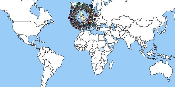
The International Organisation for Migration has a visualisation which allows users to see at a glance the multinational make-up of countries` populations.
Using data taken from the World Bank in 2010, it built a tool which helps users comprehend the numbers for inward and outward migration in each individual country.
To use the visualisation, click on a country and see the pattern of migration to or from the nation.
Each circle represents up to 20,000 people, which you can hover over to see the nationalities thereof.


-1741278702.jpg&h=190&w=280&zc=1&q=100)


