Check out his animation below, where every circle you see is a planet. (Our solar system is on the far right.)
What you`re seeing here is our solar system among every exoplanet that the Kepler telescope has identified since NASA launched it into space in 2009. In order to make each planet visible, the sizes are not to scale.
In total, the animation reveals a jaw-dropping 1,705 exoplanets in 685 planetary systems — just like our solar system, many other star systems contain more than one planet.
The size of each planet`s orbit is to scale, so if you compare the speed of most exoplanets to the planets in our solar system, you can see that many are moving much faster, which means they`re significantly closer to their parent star.
Moreover, on the left, Kruse provides a color gauge that corresponds to the different temperatures of each planet, measured in Kelvin. (The locations of exoplanets in the animation don`t necessarily correlate with their true location within the Milky Way galaxy.)
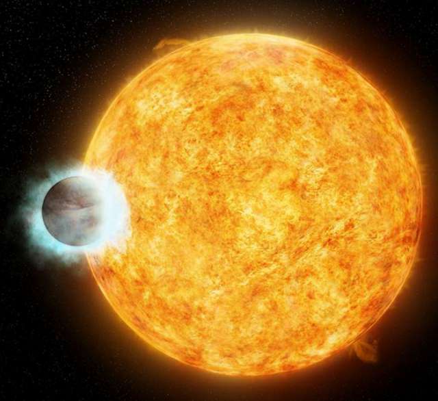
Many exoplanets observed to date are larger than Earth and scorching hot. Experts call these "hot Jupiters," (illustrated below) which can have surface temperatures that reach 1800 degrees Fahrenheit.

While that`s far too hot for any life, that we know of, to survive, there are some exoplanets similar in size and temperature to Earth. And it`s these distant celestial orbs that give some astrobiologists hope.
Some scientists even think that by studying the atmospheres of these Earth-like exoplanets, we could discover the first signs of extraterrestrial life.
We first learned about Kruse`s incredible animation on the wildly popular website: Astronomy Picture of the Day.
You can make your own animation using the source code that Kruse provides here. You can also check out a similar animation that Kruse made in 2013 on YouTube or below:
More about:


